Callout boxes
Callout boxes are a way to highlight important information in your presentation. They can be used to draw attention to key points, provide additional context, or emphasize warnings and tips.
showybox: 2.0.4 to build the callout boxes used by its built-in themes.Types of callout boxes
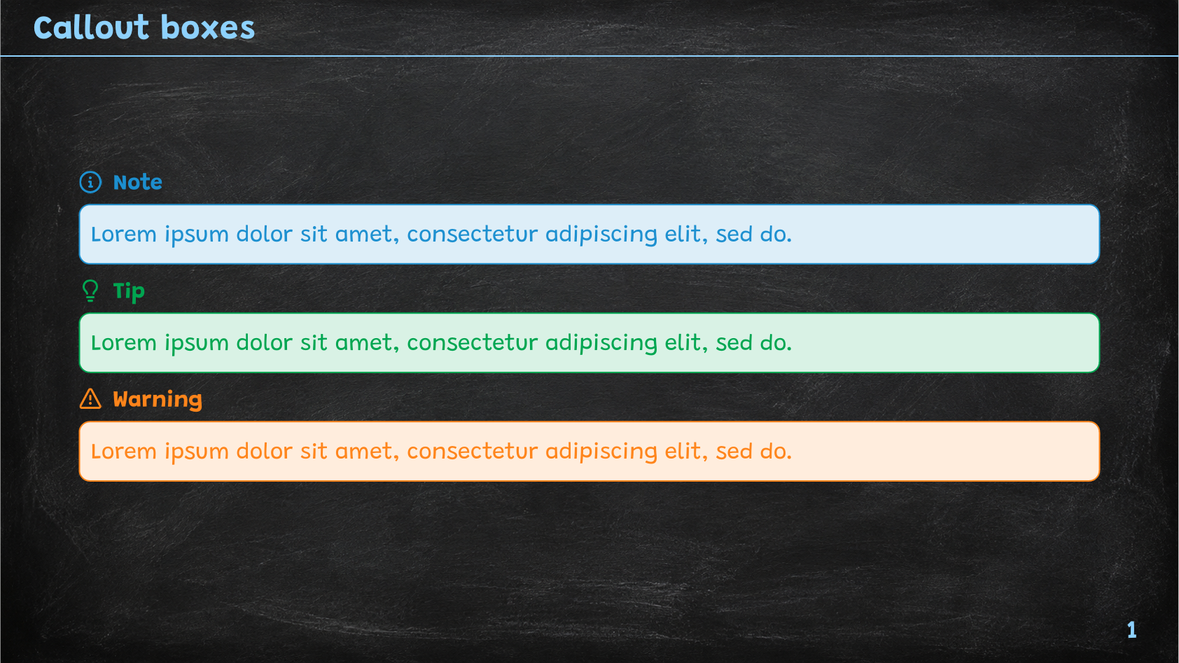
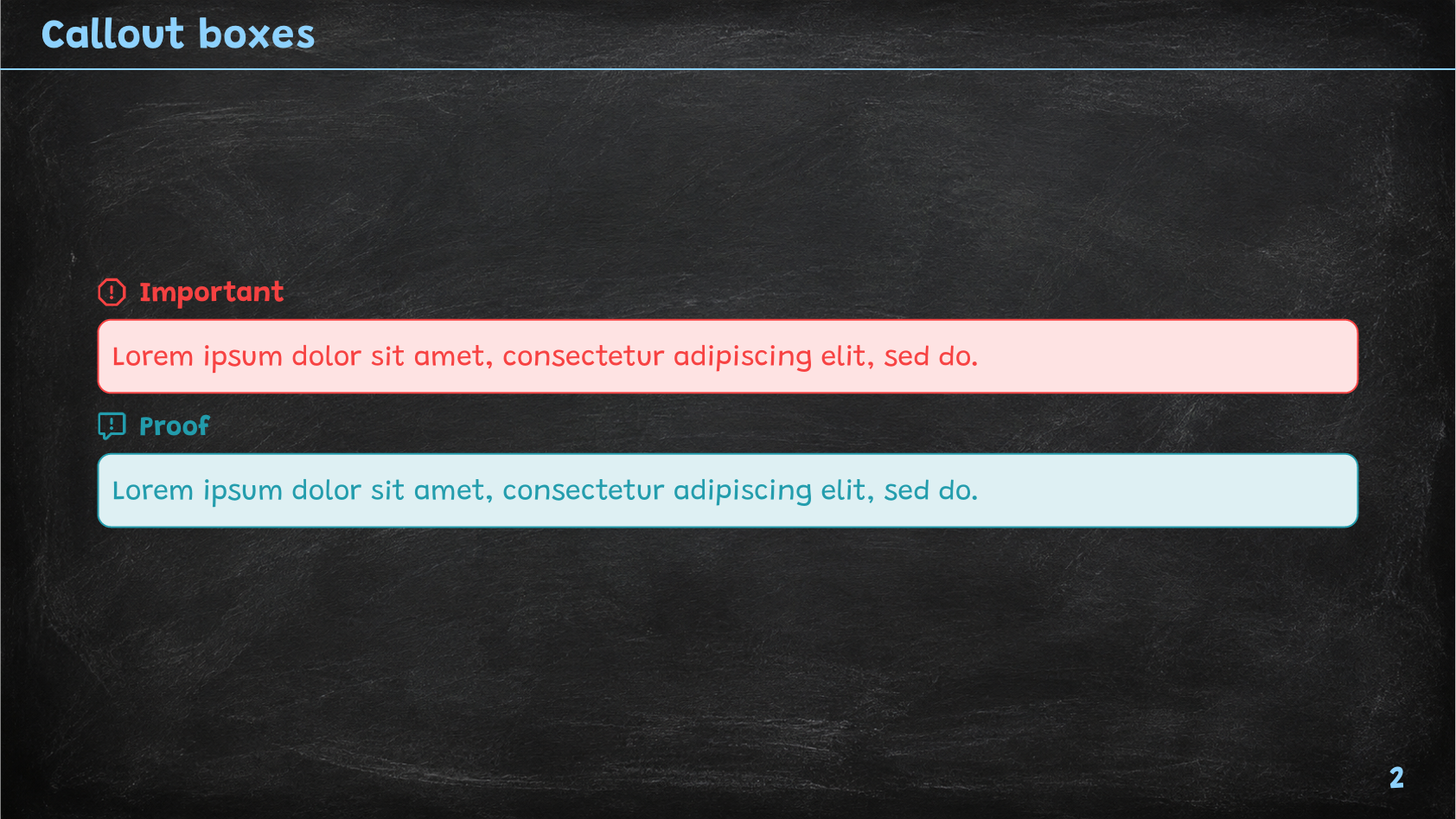
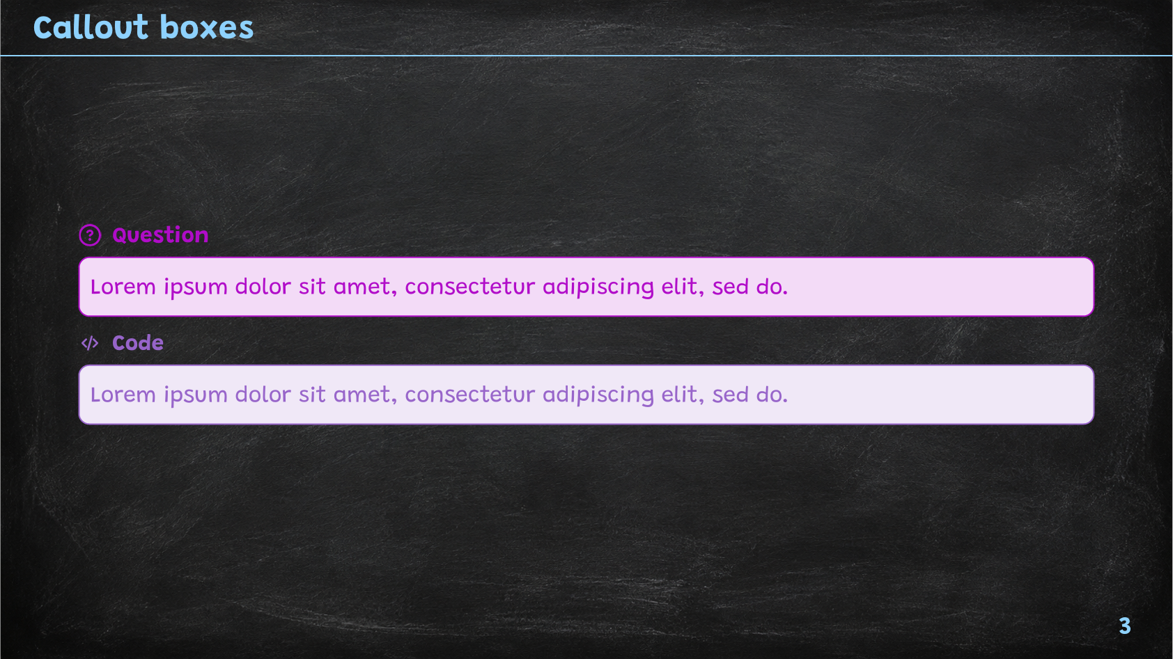
Slydekit provides several types of callout boxes, each with its own purpose and style. The available types are:
info-box: Used for general information or notes.warning-box: Used to highlight warnings or important cautions.tip-box: Used to provide helpful tips or suggestions.important-box: Used to emphasize critical information that should not be overlooked.proof-box: Used to present proofs or logical arguments.question-box: Used to pose questions or prompts for the audience.code-box: Used to display code snippets or programming-related content.
All of these callout boxes are variations of the custom-box function, which can be defined in the theme with the following signature:
#let custom-box(
title: none,
icon: "info",
color: rgb(29, 144, 208),
body
)title – default: noneThe title of the callout box. If set to none, no title will be displayed.
icon – default: “info”The icon to display in the callout box. This can be any valid icon name from the Slydekit icon set.
The available icons are: info, warning, tip, important, proof, question, and code.
color – default: rgb(29, 144, 208)The color of the callout box. This can be any valid color value.
bodyThe content of the callout box. This can be any valid Typst content, including text, images, and other elements.
You can use the custom-box function to create your own callout boxes with custom titles, icons, and colors or use it directly in your presentation.
Example usage
Each built-in theme has its own visual style for the callout boxes, but they all share the same interface through the fixed theme contract.
== Callout boxes
#info-box[#lorem(10)]
#tip-box[#lorem(10)]
#warning-box[#lorem(10)]
==
#important-box[#lorem(10)]
#proof-box[#lorem(10)]
==
#question-box[#lorem(10)]
#code-box[#lorem(10)]Simple
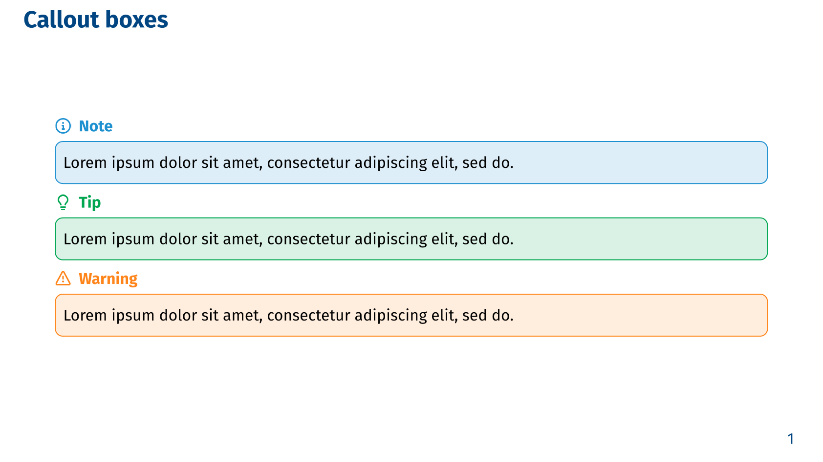 Callout boxes - Simple theme, Part 1
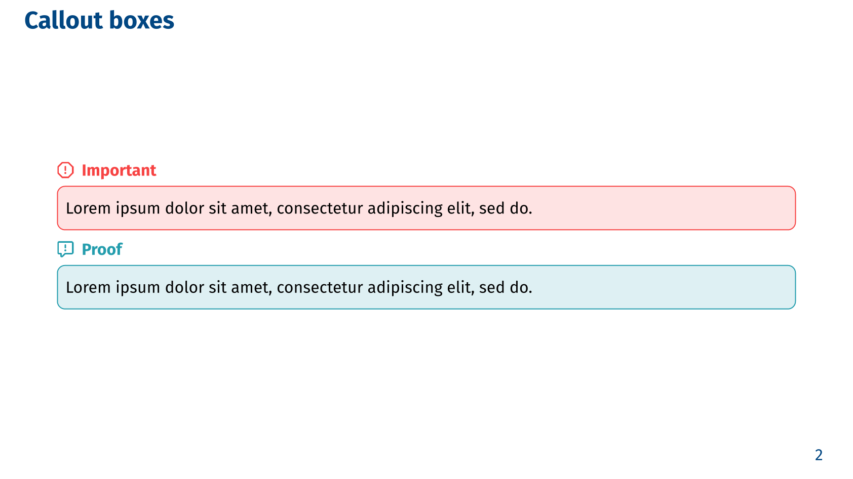 Callout boxes - Simple theme, Part 2
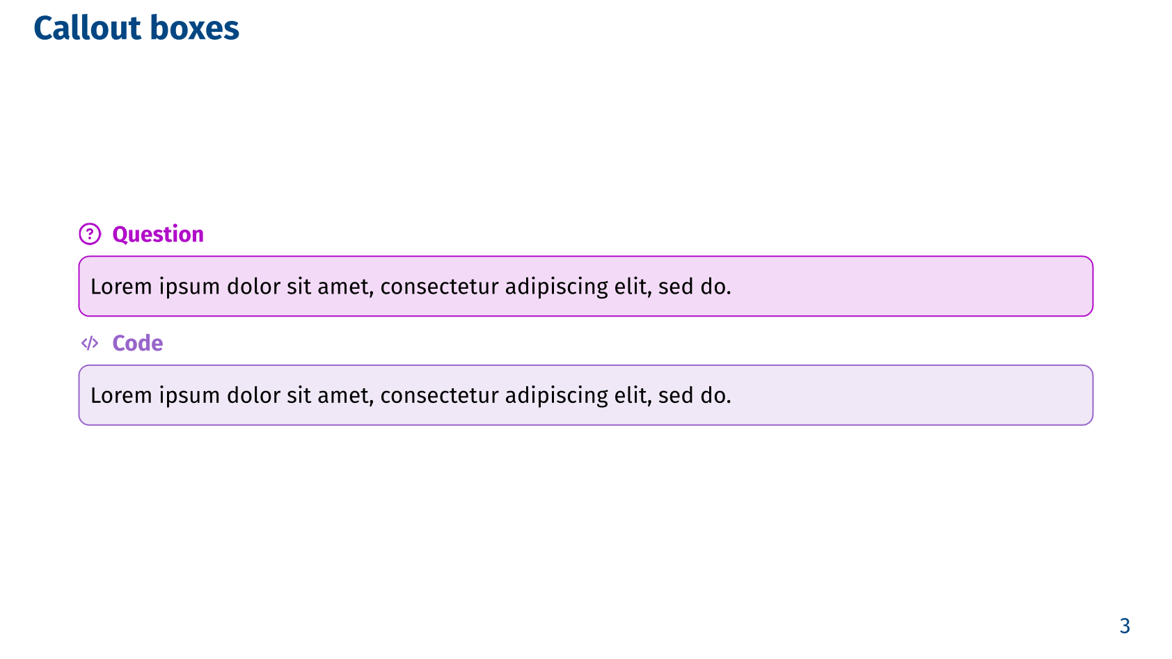 Callout boxes - Simple theme, Part 3
Metropolis
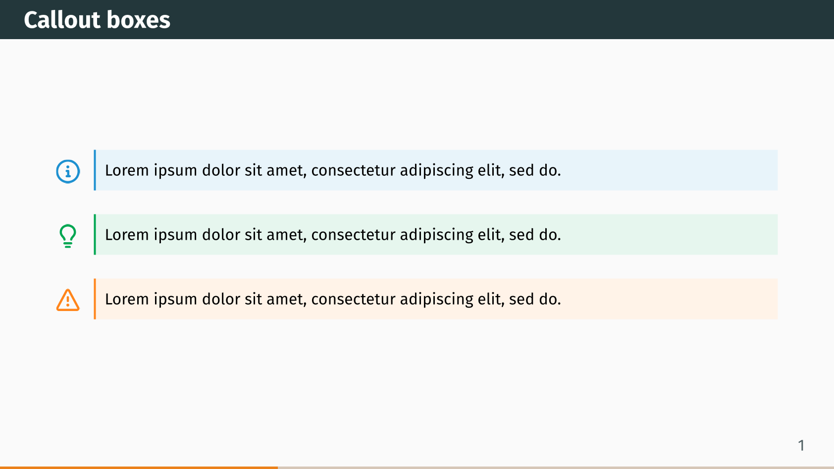 Callout boxes - Metropolis theme, Part 1
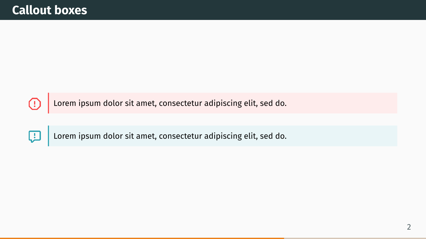 Callout boxes - Metropolis theme, Part 2
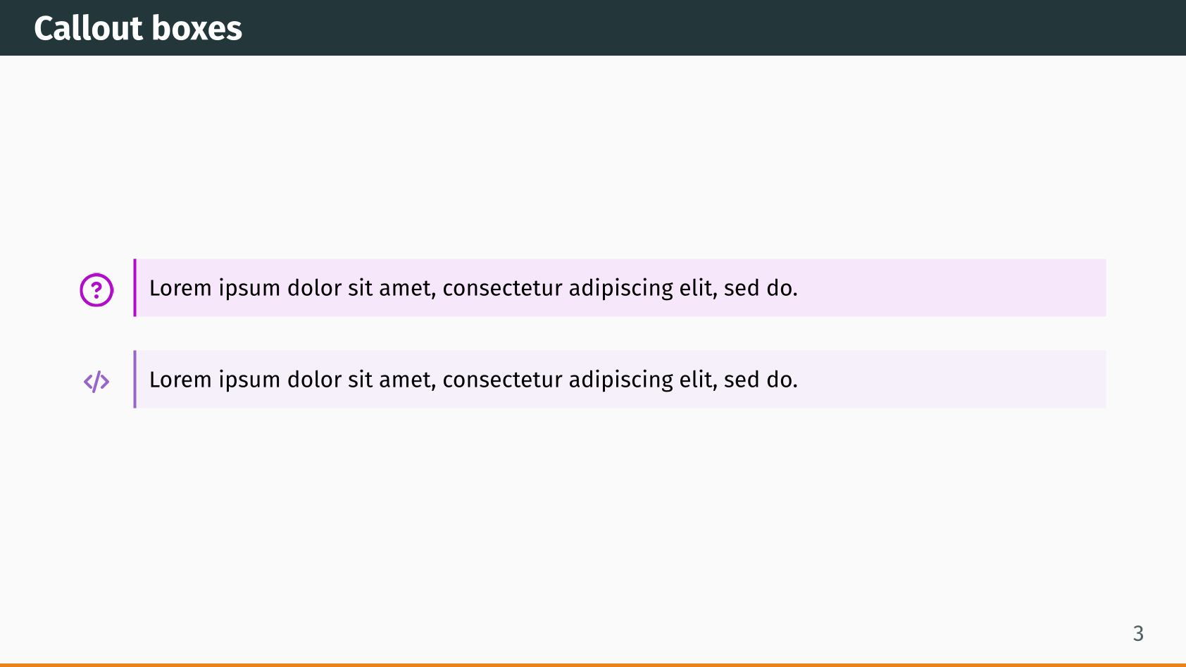 Callout boxes - Metropolis theme, Part 3
Fancy
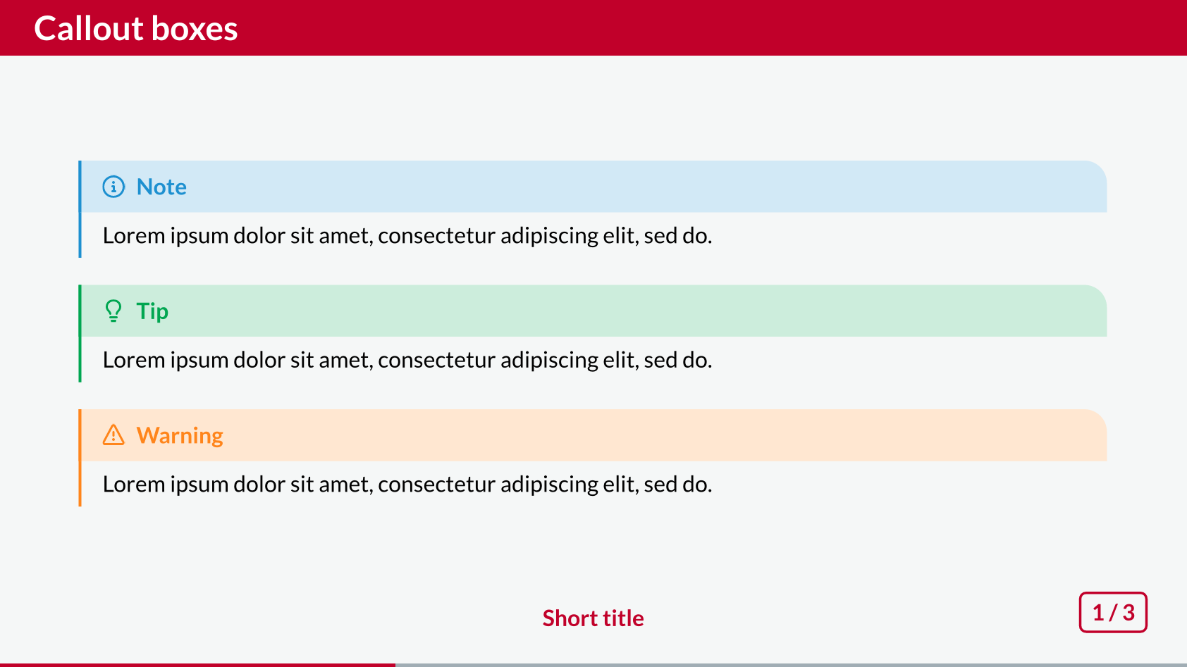 Callout boxes - Fancy theme, Part 1
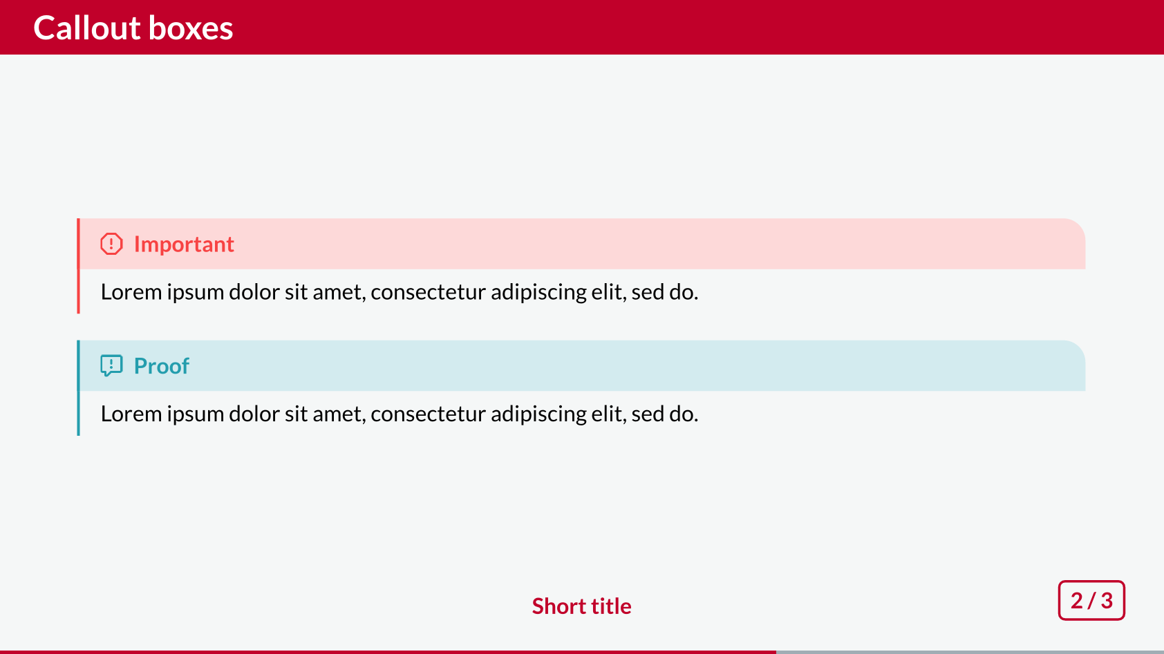 Callout boxes - Fancy theme, Part 2
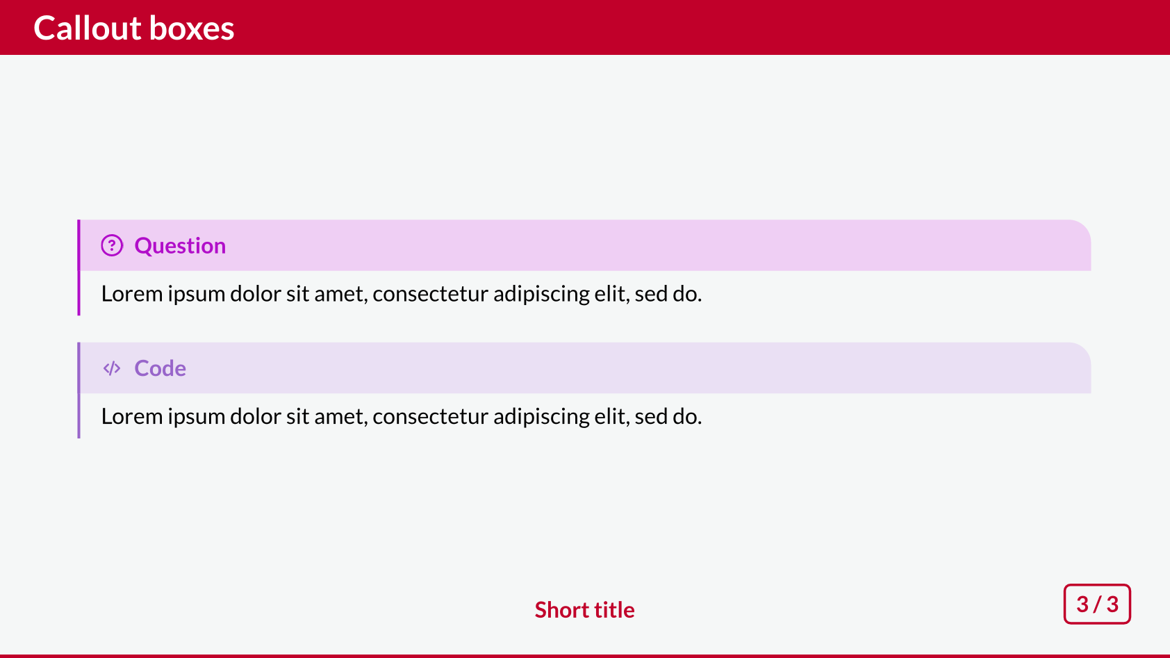 Callout boxes - Fancy theme, Part 3
Cambfurt
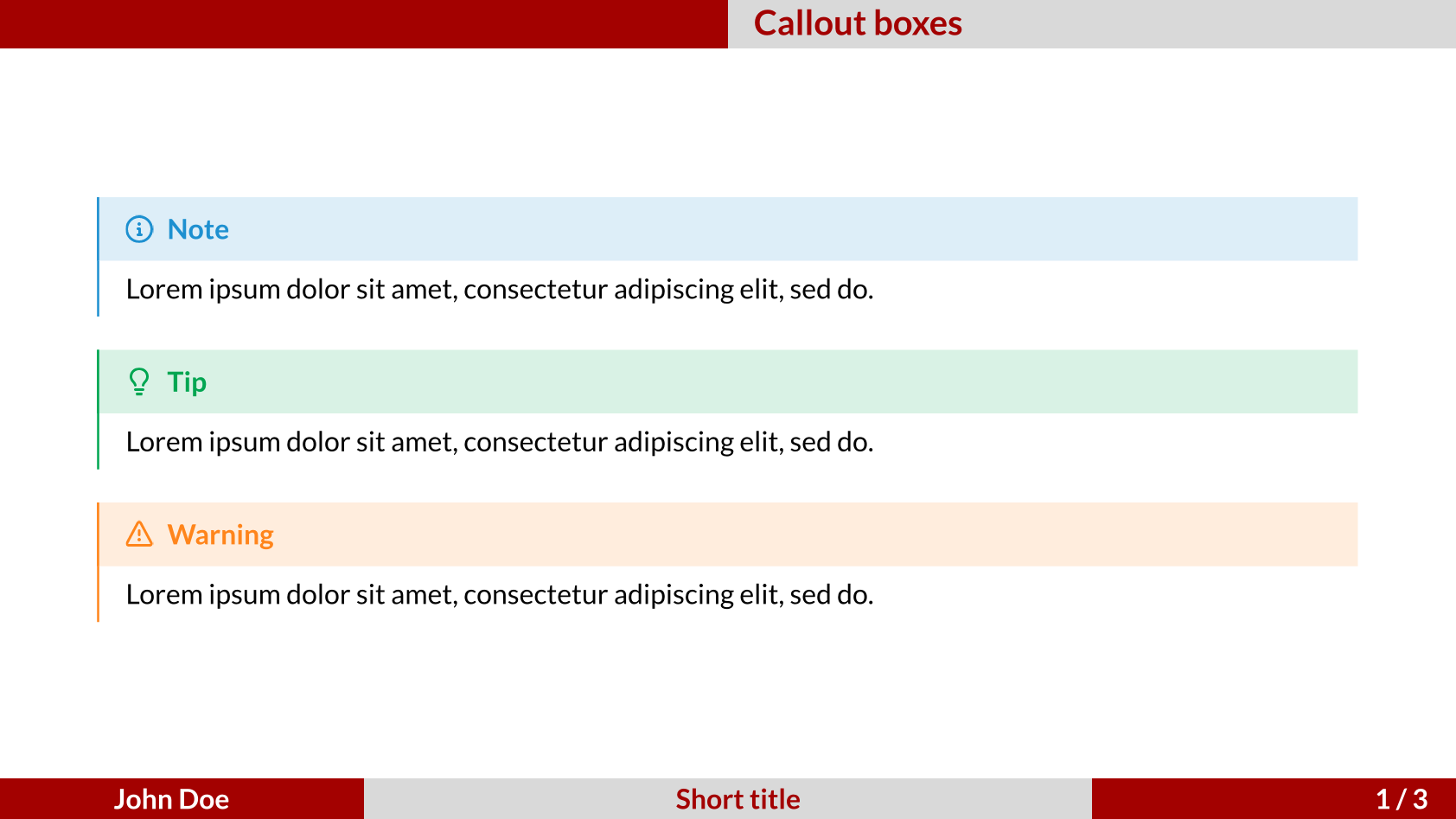 Callout boxes - Cambfurt theme, Part 1
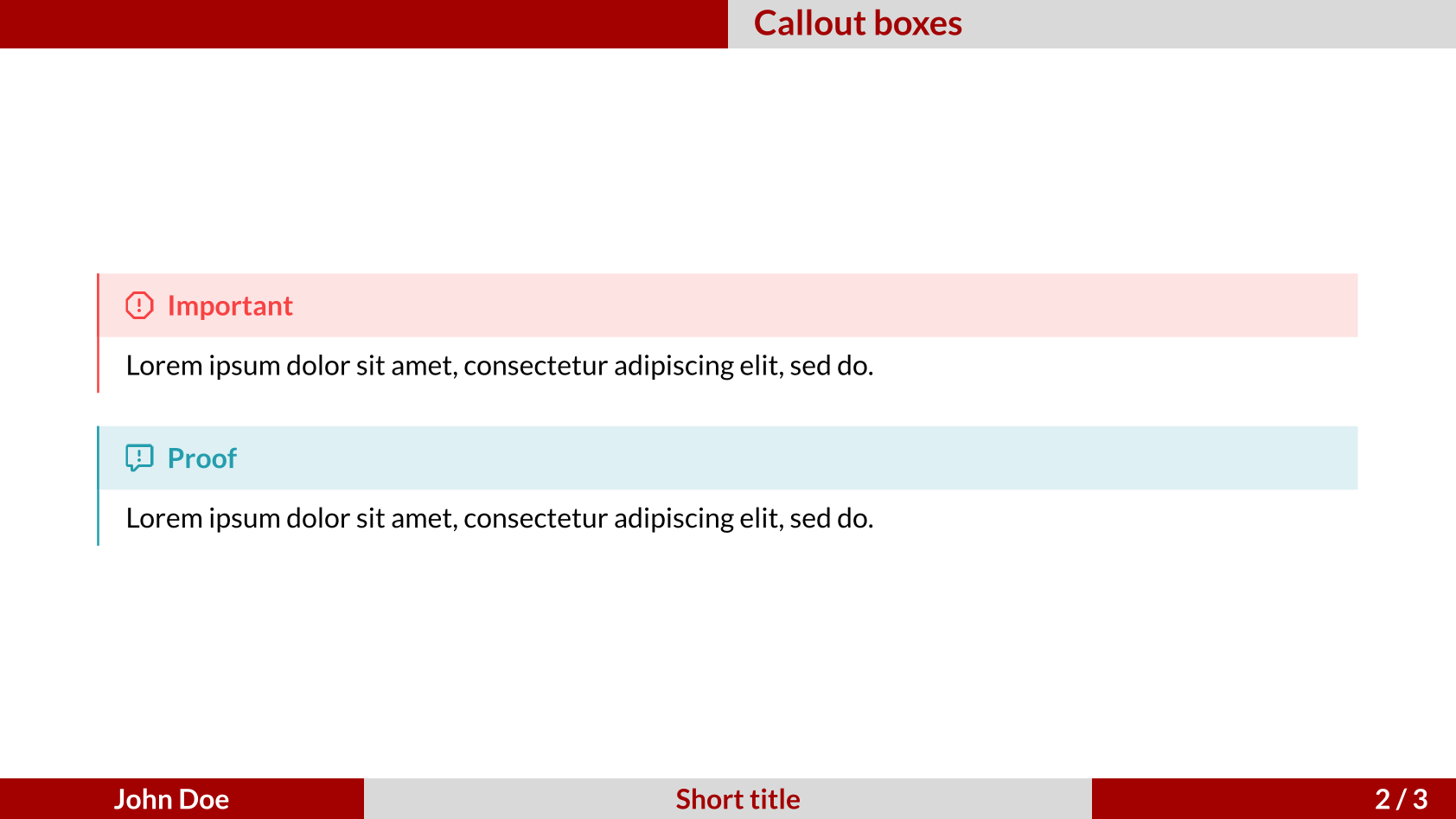 Callout boxes - Cambfurt theme, Part 2
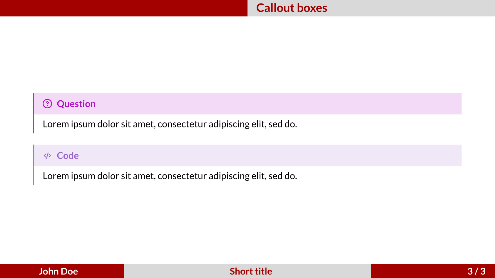 Callout boxes - Cambfurt theme, Part 3